Marketplace came to Clockwork with a big ask. They were a well-oiled machine that produced multiple radio broadcast episodes each day. The focus of their marketing and brand department was all about auditory experiences. But as they examined their mission "to raise the economic intelligence of the country" they recognized the need to reach a younger audience, one that was digital-native and likely didn't listen to the radio as much as their older counterparts. This was a critical need, because as a member-funded organization, their business relied on continuing to reach and stay relevant for younger populations.
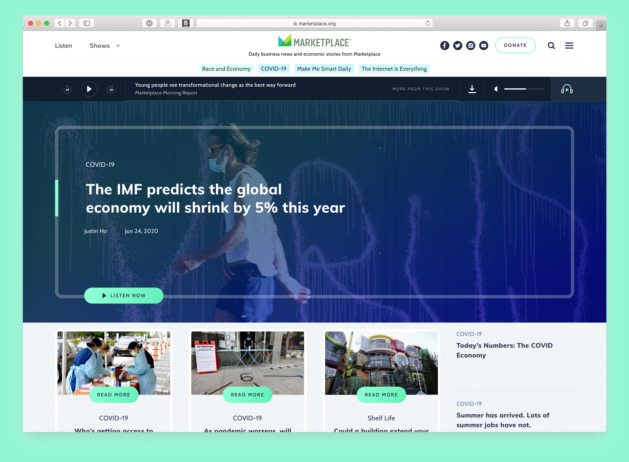
When I was brought into the project, Marketplace had already bought into the strategy of rebuilding their website to be a hub for their digital content, enabling a new generation of listeners to have an easier time finding and listen to their content directly on their website.
What the leaders at Marketplace were craving was a new look and feel to match their modern strategy. I worked with the team of two designers and digital strategist to restart the branding and creative process, using their mission and content/tone guidelines as our starting blocks.
We translated brand tenants like “casual conversations, unorthodox stories, and unexpected angles” into visual components that could span multiple channels and would be appealing to a younger and more diverse population. Our process took iterative steps, starting with mood-boards that built into page concepts and then into site themes. We continued to center the audience's experience by running internal focus groups to get feedback on our designs as we built them.
'Minting' a new Marketplace
Giving a 30-year old brand a cohesive facelift.
Other Team Members
Amber James, Content Strategist
Adam Toth, Designer
Carly Nixon, Designer
Sam Gordon, Designer